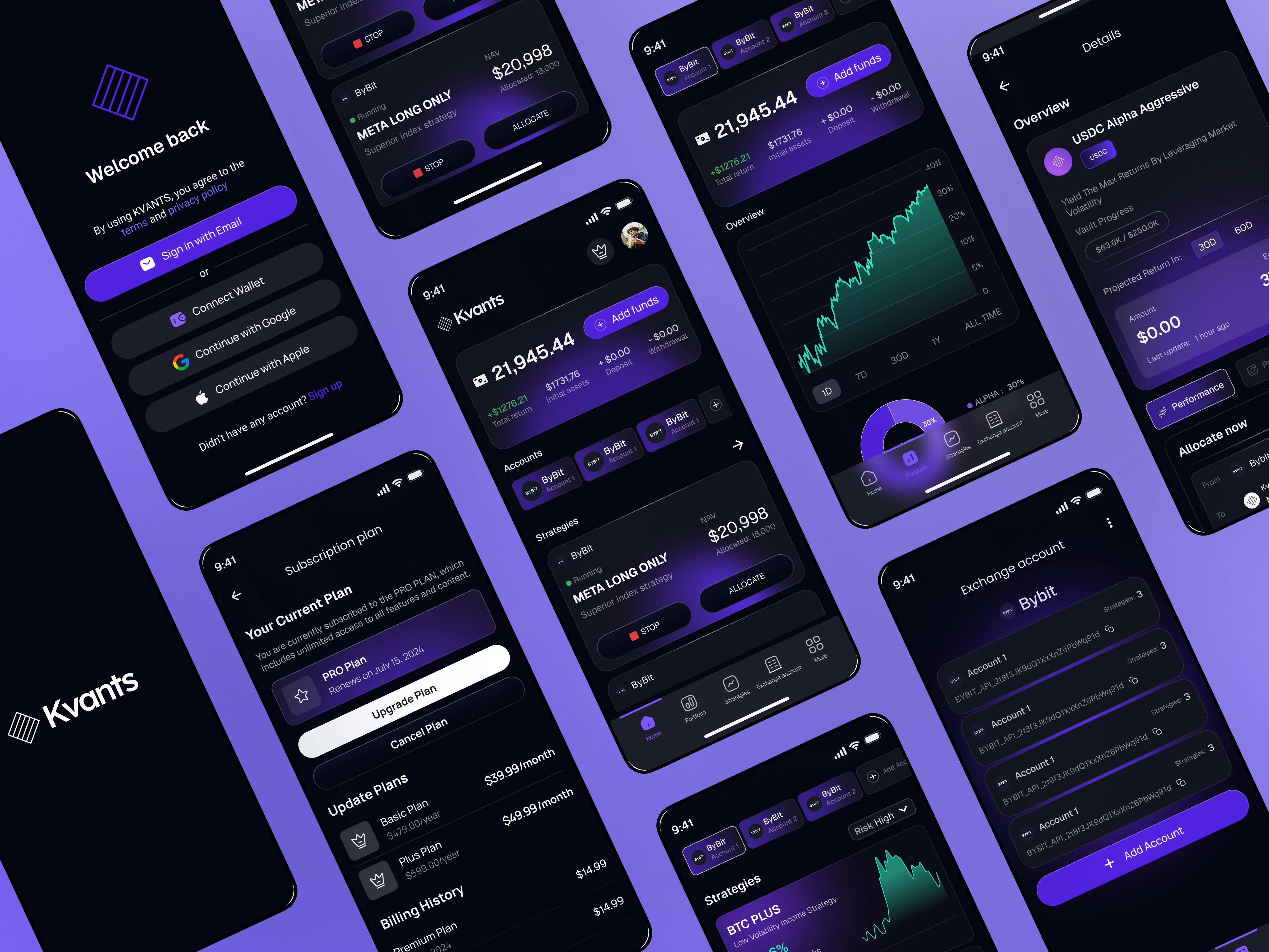
Kvants – Crypto Copy Trading Platform
Kvants is a crypto-based copy trading platform where users can follow pre-configured strategies and allocate their portfolio automatically. The product includes subscription-based access (via staking or payment), KYC verification, wallet integration, and real-time strategy management. My role was to design both the Admin Dashboard and the User Mobile Experience, ensuring clarity, trust, and usability in a complex financial environment.
Product Design
UX/UI Designer
25-06-2025

What is it
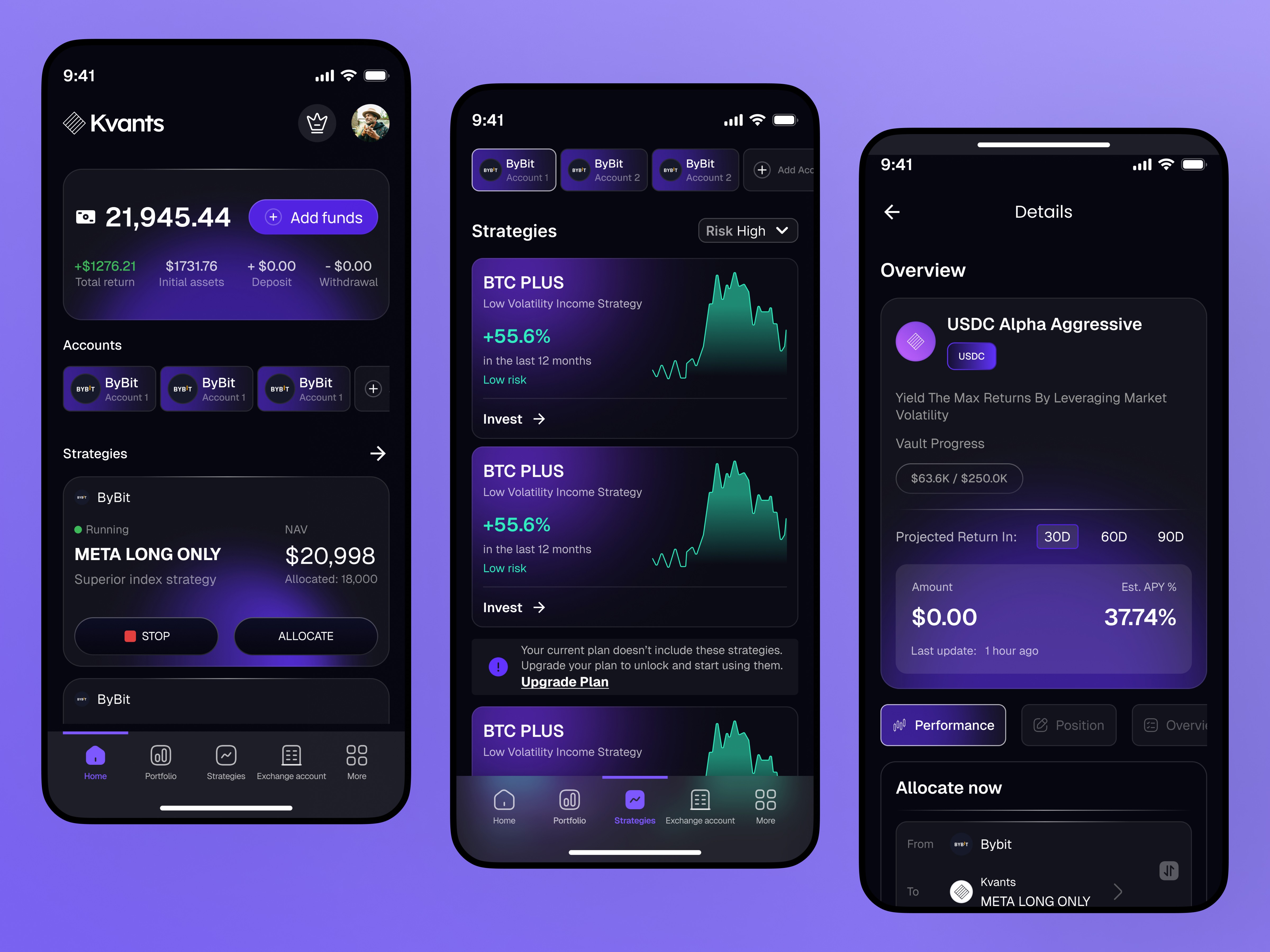
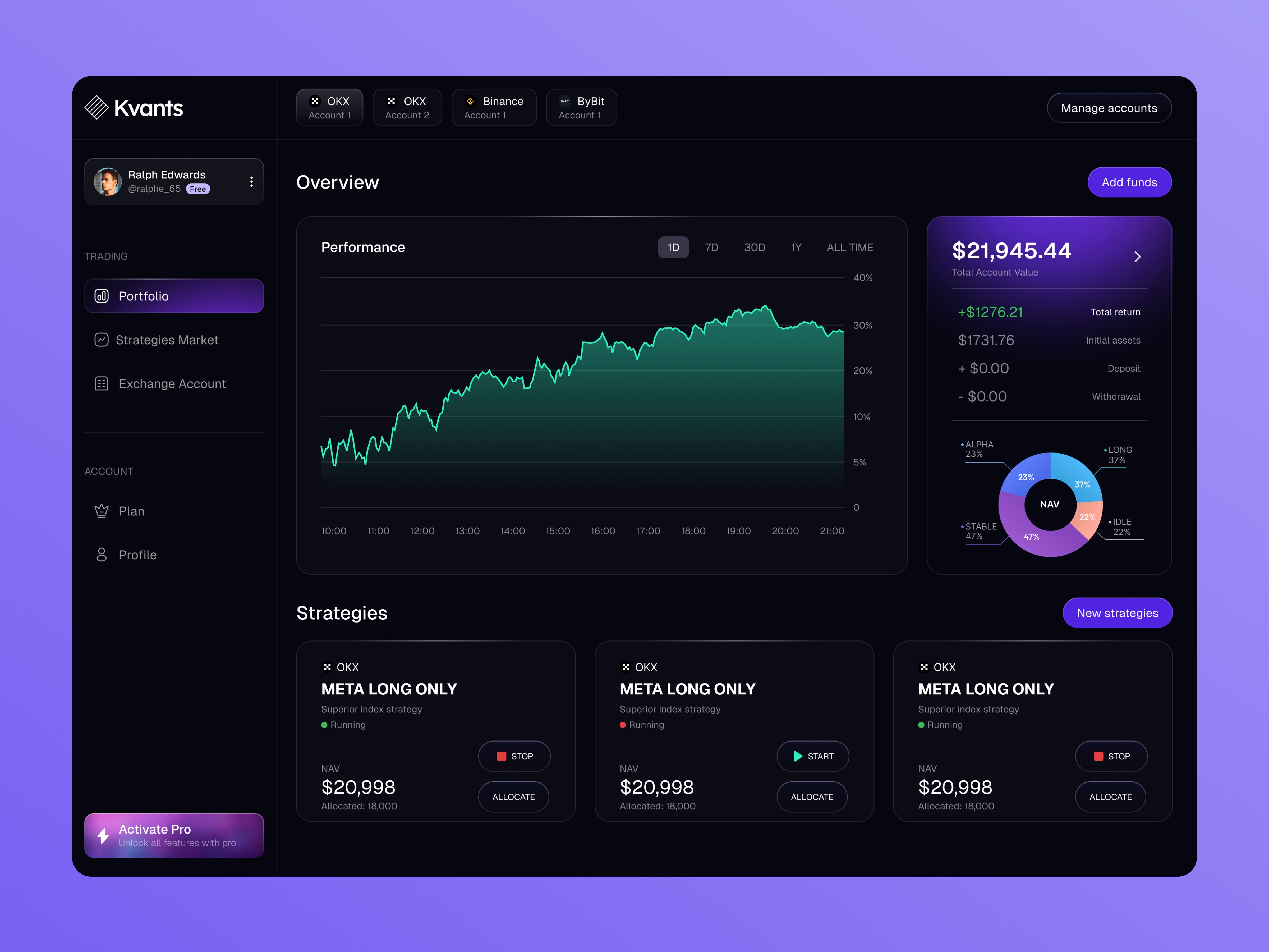
Kvants allows users to:
Browse available trading strategies
Subscribe via plan purchase or crypto staking
Allocate funds to selected strategies
Track performance in real time
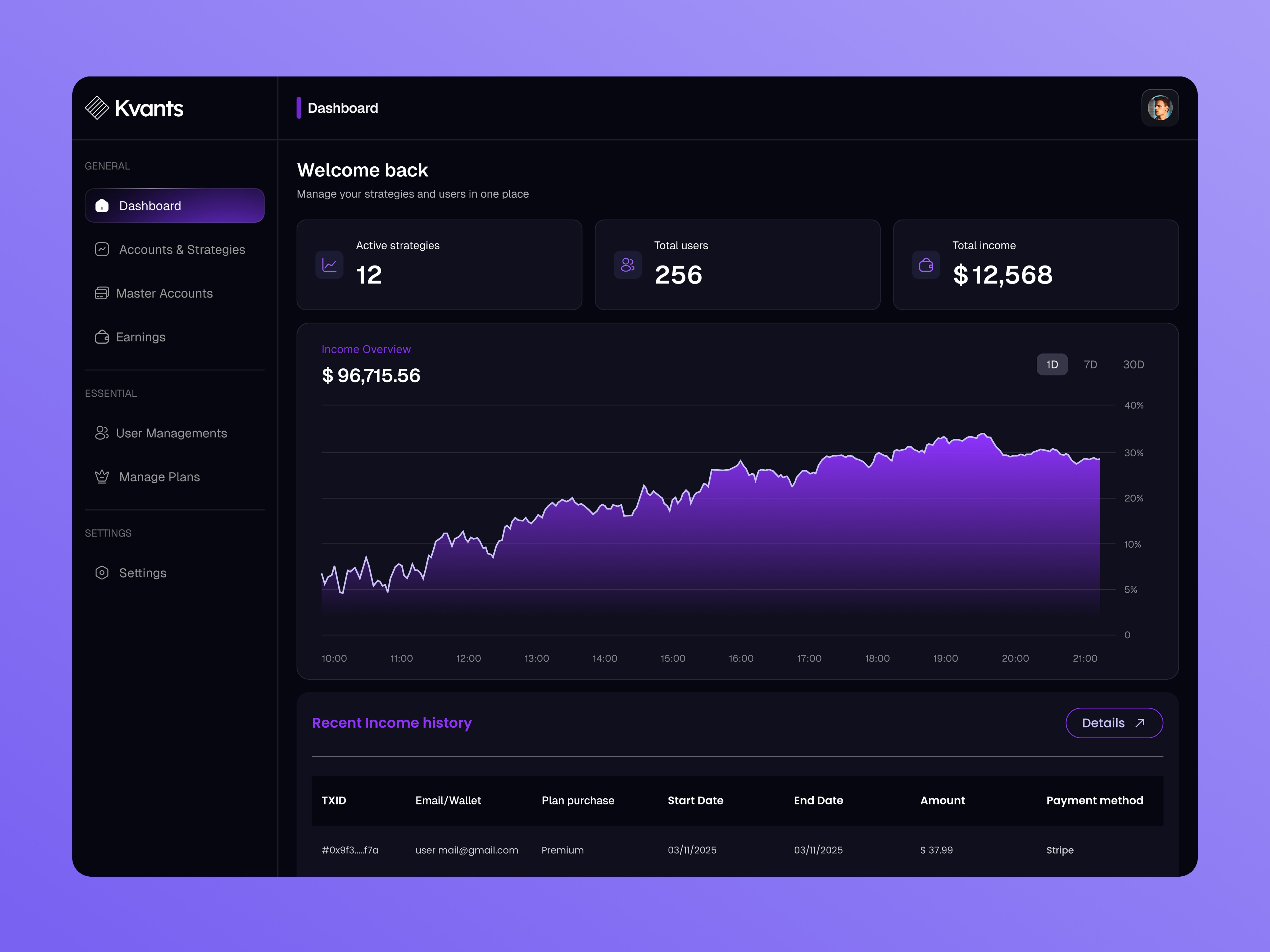
On the backend, administrators:
Create and manage strategies
Assign strategies to subscription plans
Monitor income from subscriptions
Manage users and plan eligibility
The challenge was to simplify complex financial actions into a clean and understandable experience.
How I think
When designing Kvants, I focused on three principles:
Clarity over complexity
Crypto trading is already complex. The UI should not add more confusion.Guided access control
Users can see everything, but can only interact with what they’re eligible for.
Trust-first design
In financial products, users must feel safe before they feel excited.
I prioritized transparency, clear warnings, and strong microcopy to reduce risk and hesitation.
What are the challenges
Designing Kvants involved several complex UX challenges:
Users can see all strategies but may not be eligible to allocate
Subscription plans limit access dynamically
Staking replaces traditional payment flow
KYC is handled via a third-party redirect
Stopping strategies can cause slippage loss (up to 5% NAV)
Wallet connection is required but must feel secure
Balancing flexibility, restrictions, and trust was the main challenge.
How I solve
I solved these challenges through:
Transparent Access System:
Eligible strategies appear at the top
Locked strategies are visually differentiated
Clear toast messages explain why some strategies are restricted
Educational Microcopy:
Instead of technical warnings, I used beginner-friendly language such as:
| “Stopping this strategy will market sell all positions and may cause slippage up to 5% of NAV.”
Smart Toast & Modal System:
KYC reminder toast
Subscription upgrade toast
Strategy lock notification
Stop strategy confirmation modal
Users always know what’s happening before taking action.
Clear Staking Promotion:
I designed onboarding modals to explain staking as an alternative to traditional payment — simple, motivating, and not overwhelming.
The methods I followed
User flow mapping
Information architecture planning
Role-based system thinking (Admin vs User)
UX writing for fintech clarity
Constraint-based design (limited budget & feature scope)
Cross-platform mobile-first approach
Scenario-based edge case testing
I also applied Material Design principles to ensure consistency across Android and iOS.
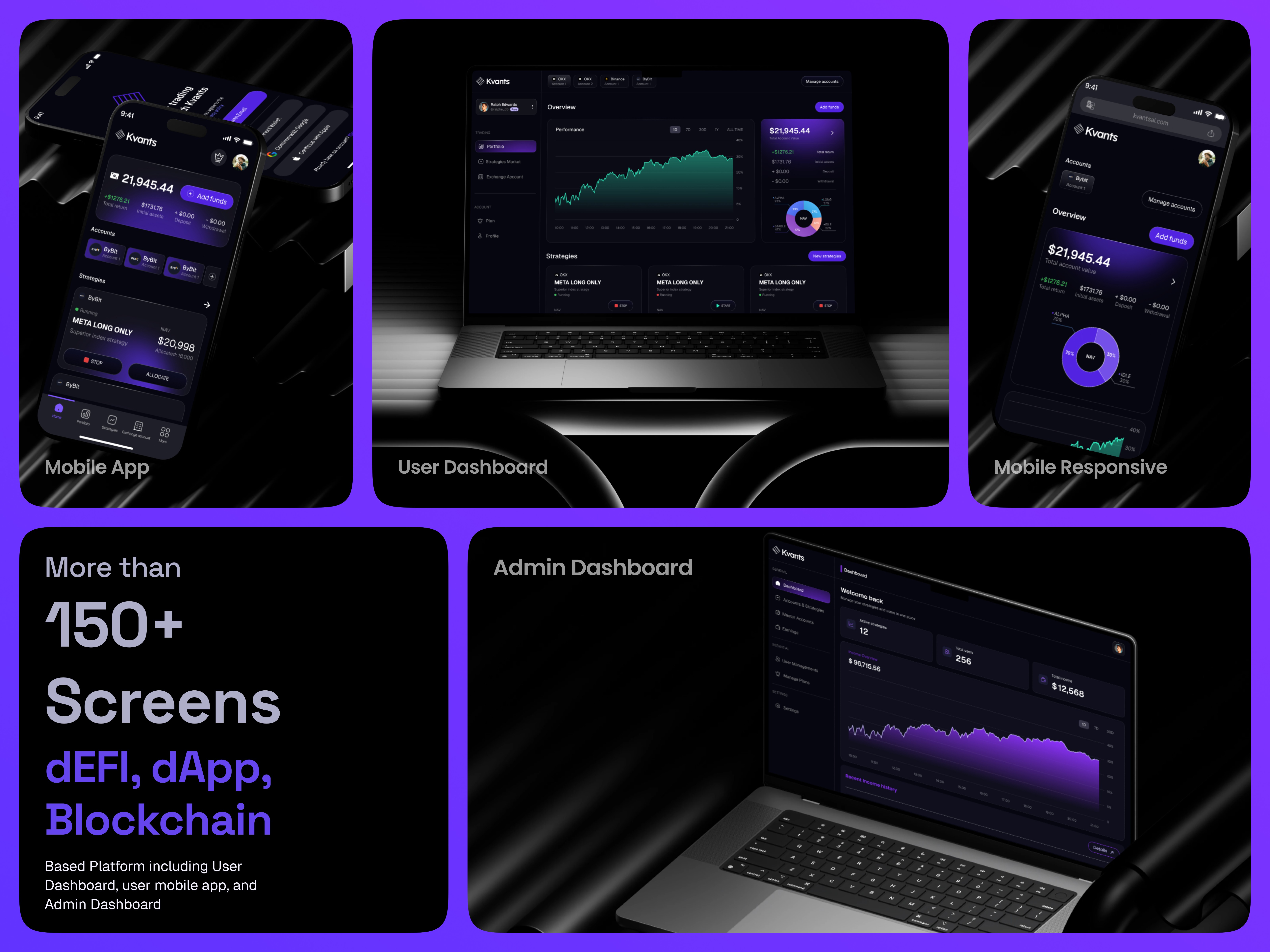
Final design
The final output includes:
Admin Dashboard:
Strategy management
Subscription plan management
Income tracking
User management
Controlled access logic
User Mobile App:
Strategy browsing with eligibility logic
Subscription purchase & staking flow
Wallet integration
KYC redirection system
Risk-aware stop strategy modal
Contextual toast guidance
The system ensures users always understand:
What they can do
Why something is restricted
What action they need to take
Usability testing
During testing, I observed:
Users were confused about locked strategies
I added lock visuals + toast explanation
Users hesitated before stopping strategies
I redesigned the warning modal with clear consequences
Users didn’t understand staking immediately
I created educational onboarding modals
After iteration:
Users completed onboarding faster
Reduced support questions around eligibility
Improved clarity around plan upgrades
Conclusion
Kvants demonstrates how complex crypto systems can be transformed into intuitive, user-centered experiences.
By combining clear UX writing, structured access control, and thoughtful onboarding, I designed a product that feels secure, modern, and easy to use even in a technically complex environment.
This project strengthened my ability to design fintech systems that balance flexibility, risk transparency, and business logic.